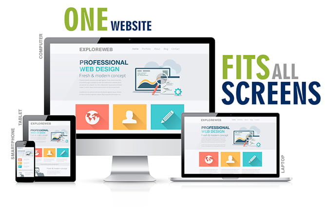
RESPONSIVE WEB DESIGN
According to a survey, mobile internet users will be 1.9 billion in 2015 that is 300 millions more than desktop internet users expected in 2015. The hike is drastic in past 2-3 years. It was just 800 million in 2009. So the mobile screen is the first or maybe only where your website must render perfect. If you fail to deliver best browsing experience in those devices then probably you will lose the prospects.
A responsive website is one of the most cost-effective solution for reaching out to your audience available on various devices. From the beginning of mobile internet era, there are three different ways to reach out, first is responsive web design, second is the mobile website and third is the mobile application. All three have its own pros and cons compare to other. But as being a leading IT company we can say the first option is much easier for promotion than two others. It is most cost effective solution too as one fits all for all screen sizes. One single URL for all which is very effective for SEO as well. The mobile app is also useful but after a good customer base (for eCommerce) or online service portal for business. But for static or informative CMS we recommend a responsive website design. Mobile website has a big disadvantage of optimization and indexing in search engines.
What to expect from our Responsive Web Design Service ?
- We use percentage instead of pixels.
- We use the fluid grid for populating text and image content in the web page. It fits with any screen size perfectly.
- We use flexible media (images and videos) that adjust according to screen size.
- We use media queries in programming that makes the site responsive for any device
- Whether it is internet marketing, web design or development, we never apply the fishy practice. It is a part of our company’s philosophy.
Our clients never need to worry about device compatibility. Because it is mandatory for us.